TOP 7 TIPS TO MAKE YOUR LANDING PAGE SELL FOR YOU
I’m a self-proclaimed millennial and proud of it. Millennialism gives me insight into appreciating how things once were (I loved that floppy disk life) but also incredibly high expectations with how things should be done now.
It wasn’t too long ago that businesses refused to build websites or social media pages to promote their brand. Business owners had their set ways to market themselves and it worked. But once the online space got more and more normalized, the ones that were late to the game fell behind.
Now, it’s hard to find a business that doesn’t have a website, even a basic one. But now that expectations have risen from consumers, what if that basic, get-it-done website is holding you back?
A website is meant to, yes, explain who you are and what you do. But ultimately, it’s there to SELL. You know that “bounce rate” everyone’s talking about? It’s basically a kick in the butt telling you either:
You’re getting the wrong people to your site or
The right people get to your site but don’t take the next steps to buy from you
Anyone can build a landing page. But how can you be sure it’ll actually convert?
The trick is to start by talking to your website designer and follow the tactics that have been proven to work. I want to share with you my favorite tactics that I add to every website that I build to ensure it converts.
USE TESTIMONIALS
Have your customers sell for you! Just like you check Yelp before going to a restaurant, your customers want to learn about you from people that have worked with you in the past.
92% of people read an online review before buying and 88% of those people trust peer review more than brand-sponsored messages.
Companies know that testimonials are important, but many make the mistake of hiding them deep in their website or on a dedicated testimonial page that nobody visits.
Take it from me:
Testimonials should be EVERYWHERE on your site.
They should be one of the first things people see on your homepage.
“Shelly helped [my company] reach a level of professionalism in marketing and sales that was unprecedented in its 10 year history”
Eduardo,
Digital Marketing Strategist
They should be on your About or team page
“Hiring Nolia Roots has been a game-changer for my business. I highly recommend the team for their ability to understand your business, creativity, and leadership.”
Wayne Helms,
Business Owner
They should be front and center of your landing pages, too.
“Shelly brings energy and drive to every project she works on. She is successful not only because of her ability to get the job done but her ability to be a leader to your brand, audience, and team.”
Gina Z,
Entrepreneur
Fiverr does a great job of using video testimonials. They even transformed their entire landing page into a testimonial.

Unbounce utilizes a great example of using big-name logos, incorporating social proof. Simply seeing the logos, let alone the actual testimonial, is impressive.

USE HIGH-QUALITY IMAGES
As humans, we use all of our senses when we make a decision. It’s like when you are trying to decide if you should eat that leftover Chinese food: Does it look good? Smell good? If so, then it’ll probably taste good.
You have to cater to your consumer’s senses when building your landing page. The design of a website drives our first impression 94% of the time. It takes us a fraction of a second to absorb it all and we subconsciously decide whether we want to stick around or not immediately.
Using high-quality images on your landing pages is one of the easiest ways to keep people around.
One of my clients, Bateman-Allen Funeral Home features an excellent background image at the top. In this industry, the exteriors are everything for a first impression. So we decided to put that front and center.

Here’s another example from Uber that does something similar but shows a happy, smiling driver when you hit the site.

Notice that NONE of these images are stock images. There’s a huge difference.
Consumers want to see authenticity. Conversion studies have shown that real images almost always outperform stock ones – even the good stock ones!
As an example, Visual Website Optimizer ran a test that compared a fake, stock truck driver with a real one.
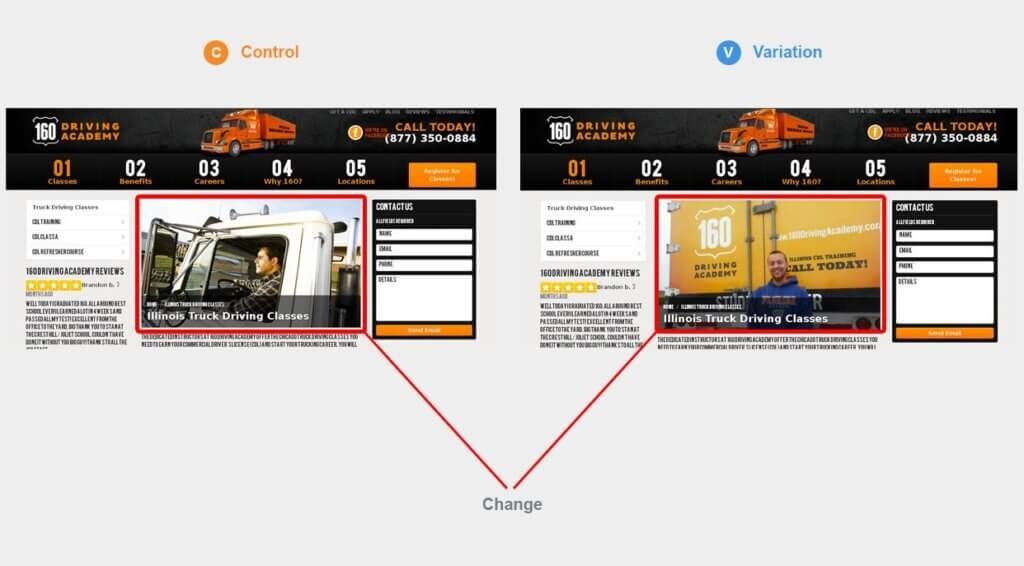
Turns out, the landing page with a real person pulled in over 161% more clicks and a 38% increase in registration.
It’s always best to hire a good photographer and get real, genuine images of your product, office, and staff for your website.
LIMIT CHOICES
This one I see brands overdo a lot. We all know that it’s important to have calls to action on your site. But what’s a CTA if you’re calling for them to take 4 different actions?!
Even the techiest website visitor needs explicit direction on what you want them to do next. When in doubt, keep your landing pages as simple as possible with only one choice on your landing page.
The last thing you want to do is confuse visitors by presenting multiple options. It turns into information overload and may just make a visitor click that back button.
Decide! What’s your biggest goal from your site? Do you want them to sign up for your newsletter? Do you want them to contact you right away? Think about your customer journey (and if you don’t have one you need one!) — what does your potential customer need to turn from prospect to client? A meeting? Additional information? Maybe a freebie? Whatever that is, make sure you have that as your main CTA

LIMIT SCROLL LENGTH
Even though you should still keep your USP “above the fold,” users are starting to scroll through to see more. In fact, they often spend over 66% of their time scrolling down to see what lies underneath.
That doesn’t mean we should overload landing pages, though. Sometimes, long-form sales pages work well when running paid campaigns to cold traffic. But they can also backfire, depending on what you want your visitor’s next step to be.
Keep your landing page short and sweet. Add a simple opt-in and that may just do the trick.
USE SHORT, SIMPLE FORMS
Less is more! See a pattern here?
People don’t want to be signing their life away to get your newsletter, especially with all the privacy issues happening right now.
Unless you’re selling a high-priced product or service and their signing up right then and there, shorter forms tend to get filled out more than long ones.

There are two rules of thumb I use when creating forms:
Ask for only what you need. Less is best.
The “ask” should be appropriate for what you’re giving.
That means you’ll often have different form lengths for each offer. A visitor’s information is, arguably, the most valuable currency out there in the marketing world right now. However, if your giveaway or freebie is extremely valuable for your visitor, they might offer a little more of their personal details like job title or company in exchange.
ADD DIRECTIONAL CUES
If you and a friend met for lunch dining al fresco, and your friend looked over to the right and said, “Oh, that’s a beautiful bird!” What would you do?
Look over to see the bird, right?!
That’s the same design and psychological trick I always use for my website design. Whether it’s an arrow literally pointing your viewer to where you want them to look or simply a photo of someone looking in that direction, it’s guiding your visitor to where you want them to go next.

ConversionXL has run a few studies on directional cues.
Their research shows that both arrows and people looking at a page CTA can help direct user attention.
So before you work with your photographer on your next photoshoot, imagine where you want these photos to live and how you need to set up your shots to add directional queues.
Be clear on the immense value they’ll get by converting
The most IMPORTANT part of converting visitors to your sign up or offer is the offer itself. A great CTA or photo isn’t going to cover-up a shotty offer. Even if you excel at everything else on this list, if your offer doesn’t appeal to your audience, your results will suffer.
So what makes a good offer?
Focus on your audience — what are the pain points in their business? What were their pain points with other companies like yours they’ve worked with in the past?
If you have a service-based business, the value may be giving immense customer service right away. Maybe surprise them a welcome gift or give them a detailed timeline on when they should start seeing ROI if you’re B2B.
Price is also a huge contributor. Sales and promotions are always a driver.
CONCLUSION
Designing a website that converts is very different than designing a website because you know you have to. Make your website work for you! It is an investment, after all!
Between the art and science of developing an effective landing page, there’s no single formula that works 100% of the time. A lot of times, it’s trial and error, understanding the newest trends, and implementing changes quickly.
But without a doubt:
- Use testimonials
- Use high-quality imagery
- Limit visitor choices and CTAs
- Limit scrolling lengthUse short forms
- Add directional cues
- Make your offer worth it!
If you have any questions about converting more of your website visitors into customers or subscribers, email me below!
LEARN MORE
Nolia Roots can take your marketing to the next level. Read our Case Studies to see how we transformed our clients’ businesses with real results.